


Chorus.xyz Logo Design
“How do you represent fans, musicians, and venues in a minimal, yet effective visual brand?” is the question repeated over and over when kicking off the brand logo creation for Chorus.xyz.
The answer being the dawning of the ‘trifecta’ logo, which incorporates all three while utilizing cut out ‘C’ letters.
The Trifecta Logomark
Early iterations of the logomark consisted of ‘C’ shapes to represent ‘Chorus.xyz’, which are presented below.
Inspiration that was sought for the mark and overall logo was that of music, records, venues, musicians, and ‘community’.


Through the feedback process with the client, we centered in on a mark that consisted of three ‘C’s cut that also joined in the center to allude to community, artists, and venues. The mark was also the most bold and simplistic, all while creating an upwards motion within the center negative space, creating an arrow.
The mark would lend itself to many fun and interesting explorations and applications, mainly incorporating artists within the shape as seen below.

The following steps were to pair the logomark with a wordmark that was equally as bold, yet carried characteristics within the typeface.
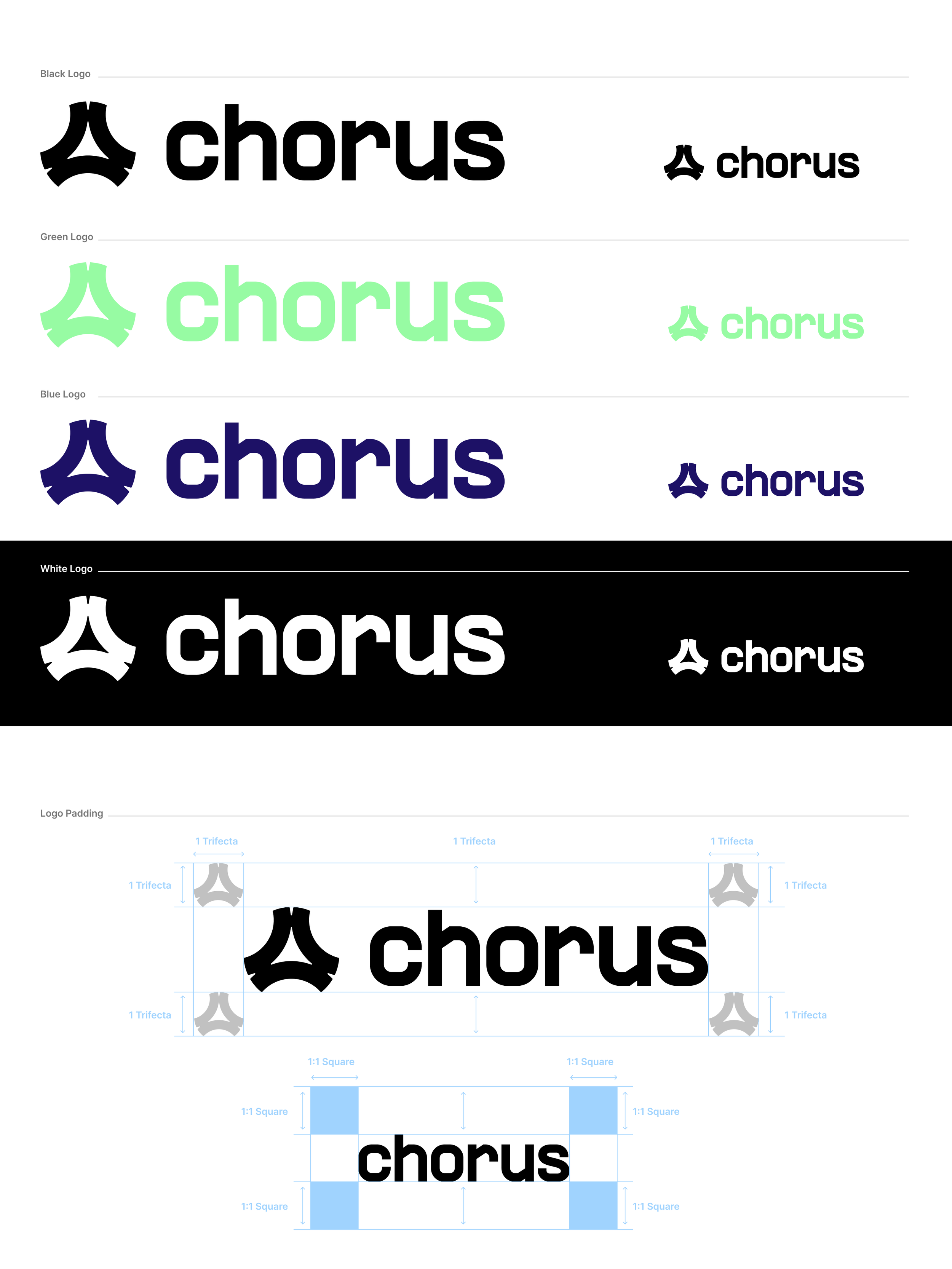
The result was a powerful combination of the logomark and the wordmark.

Guidelines were also necessary for the brand identity/system. What follows are some examples of the guidelines.

Thank you for viewing the Chorus.xyz project. There are more process files that can be shared upon request.